Four weeks to build-ready
A user-tested prototype, verified with devs to ensure it could be built
A redesigned due diligence tool for the UK Cabinet Office, built with GOV.UK and Salesforce to support confident, high-stakes decisions
The engagement was four weeks
The brief was to take a research wireframe and turn it into a clear, compliant, build-ready prototype for a due diligence tool used across multiple government departments
There was no access to the original tool. A wireframe showed the intended direction, and screenshots provided some context. That was everything to work from
Which meant a lot of the early work was about testing assumptions: inherited ones, made ones, and ones nobody had thought to question yet
Four weeks to rebuild a tool I'd not seen
The wireframe had identified real structural problems: nested content, unclear hierarchy, no consistent flow. The proposed solution added organisation and depth
But organising something that lacks clarity doesn't always produce confidence. And confidence was what the users actually needed
That took until week three to become fully visible
Structure and clarity aren't the same thing
Daily iteration had been shaping the prototype from the start
By week three, user testing sessions brought something more direct: real users, real workflows, real friction
One user said it plainly:
"I spent hours trying to manually fix records in an Excel file. If I could've done it like this, it would've saved me a whole load of time"
But the deeper pattern across sessions was this: users were being asked to trust data, recommendations and outcomes, without being told why those things were trustworthy or what they meant for next steps
The tool was producing outputs
It wasn't explaining itself
Users didn't need more features
They needed more confidence
Not confidence in the sense of reassurance, confidence in the sense of clarity
Evidence behind every outcome. Context at every decision point. A system that showed its working so users could act on it without doubt
That reframed everything that followed
When a record returns no match, small edits made inline can surface results that would otherwise be missed, keeping the review moving without switching tools or losing context
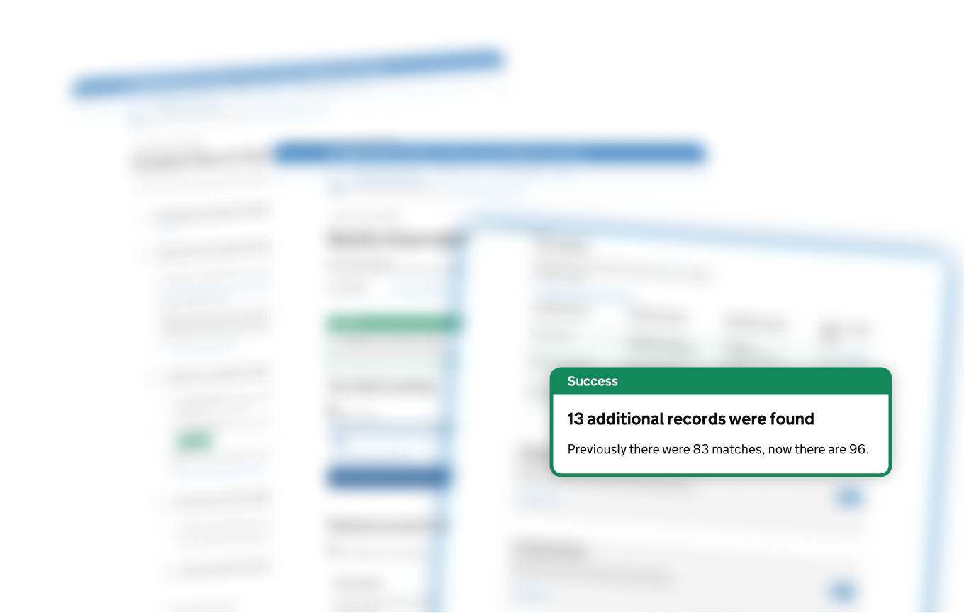
Confidence scores surface with every result, so users spend time on the matches that need attention, not the ones that don't
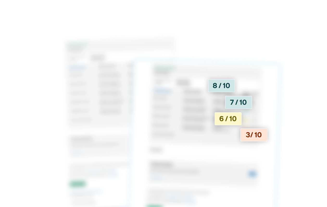
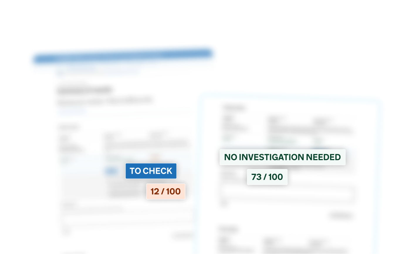
Every result carries a clear status and a score, so users have everything they need to decide what comes next
Unmatched records could be refined in place, surfacing results that would otherwise be missed
Confidence scoring made match certainty visible at a glance
Clear status flags told users exactly where to focus next, without anything outside the tool to interpret the outcome
Every state, every edge case, every unhappy path: tested and resolved before handoff
Four weeks
Build-ready
Hours spent on manual workarounds, gone
And the broader feedback confirmed what the testing had suggested: when users understood why a result was trustworthy, they could act on it with confidence
That was the gap the wireframe hadn't named
Naming it was half the job
Closing it was the other half
A user-tested prototype, verified with devs to ensure it could be built
Happy, unhappy and edge cases covered, with flows shaped to work consistently across WCAG AA and Salesforce standards
Clear, cohesive journeys designed to support multiple Government Departments and Arms Length Bodies with confidence
Single and bulk lookups in one pattern mean less switching, fewer errors
Results ranked by reliability so users know where to focus first
Traceability built into the workflow, not bolted on afterwards via a spreadsheet
Every state, every edge case resolved in prototyping, so nothing left to discover at build
Evidence-first decisions users could verify, so every outcome could be traced back to the data behind it
Accessibility as the quality bar (WCAG AA), ensuring the system remained usable across assistive technologies and high-stakes investigative workflows
Edge cases stabilised before the main journey, so complex scenarios did not break the primary flow
Consistency over endless flexibility, especially across data-heavy screens where variation would create confusion
Clear structure over dense data complexity, helping investigators interpret large volumes of case data quickly
Operational clarity over feature flexibility, ensuring the system remained dependable in daily use
Features implying certainty without evidence, which could undermine user trust in the decisions produced
User customisation that weakened consistency or traceability, making outcomes harder to verify
Automation before signals were trustworthy, avoiding decisions that appeared confident but lacked reliable data
Design for trust, not just task completion
Context, signals and recovery paths reduce stress under scrutiny
Limits sharpen design
GOV.UK, WCAG and Salesforce constraints forced clarity and reusable patterns
Prototype to think, not just ship
Pressure-tested flows exposed gaps early
Accessibility is a design choice
Contrast, focus and structure made complexity readable