+28% CTR
Customers on mobile who could see the CTA actually clicked it
A lifecycle redesign that unified 12 email journeys, boosted click-to-open rates by 41%, and made the brand's voice finally match its execution
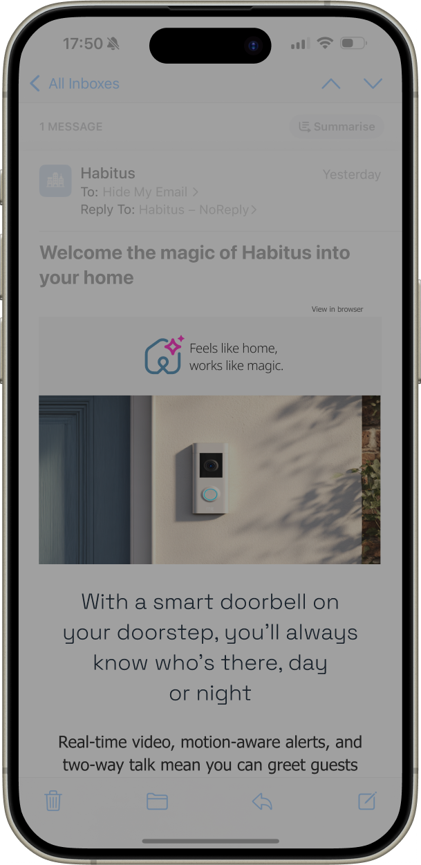
Five months with a US smart home security brand, working across consumer and business lifecycle email. Straightforward enough on paper
In practice, it was something more complicated. A small team brought in because things weren't working: not broken exactly, but unfinished. The voice was right. The instincts were right. Somewhere between strategy and send, things fell apart
Marketing were firefighting
Developers were patching brittle templates
Twelve disconnected journeys were pulling in different directions
Render simulators will tell you what an email looks like. They won't tell you what it feels like to receive one
So the obvious move was to become the customer
I signed up for everything. Every journey, every persona: the live customer, the lapsed one, the person who'd just moved into a house with the security system already installed. Not on a simulator. In a real inbox, on the devices that the data said actually mattered
It was the only way to feel where the experience held and where it quietly fell apart
The gaps weren’t in the strategy
They were hiding in the experience
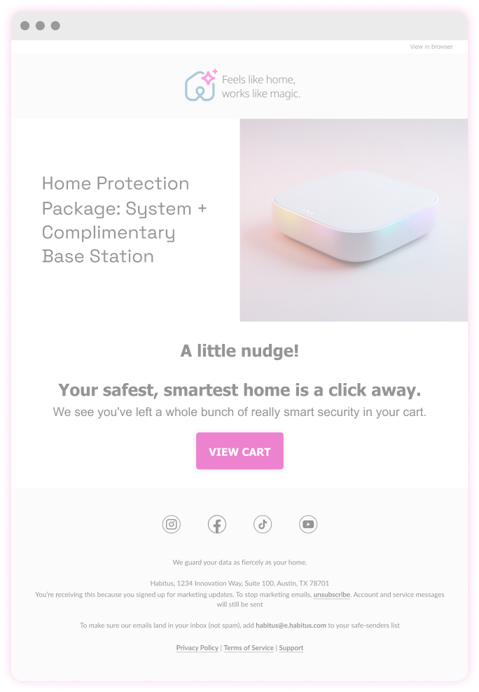
Somewhere in the middle of this, an abandoned cart email arrived
You have some items left in your cart
That was it. No image. No reminder of what was in there or why it had seemed worth buying
But the customer was already interested. They'd already done the hard part. The email's job wasn't to bring them back to the site: it was to do the thinking for them. To remind them what they'd seen, why it had felt right, and make it effortless to say yes
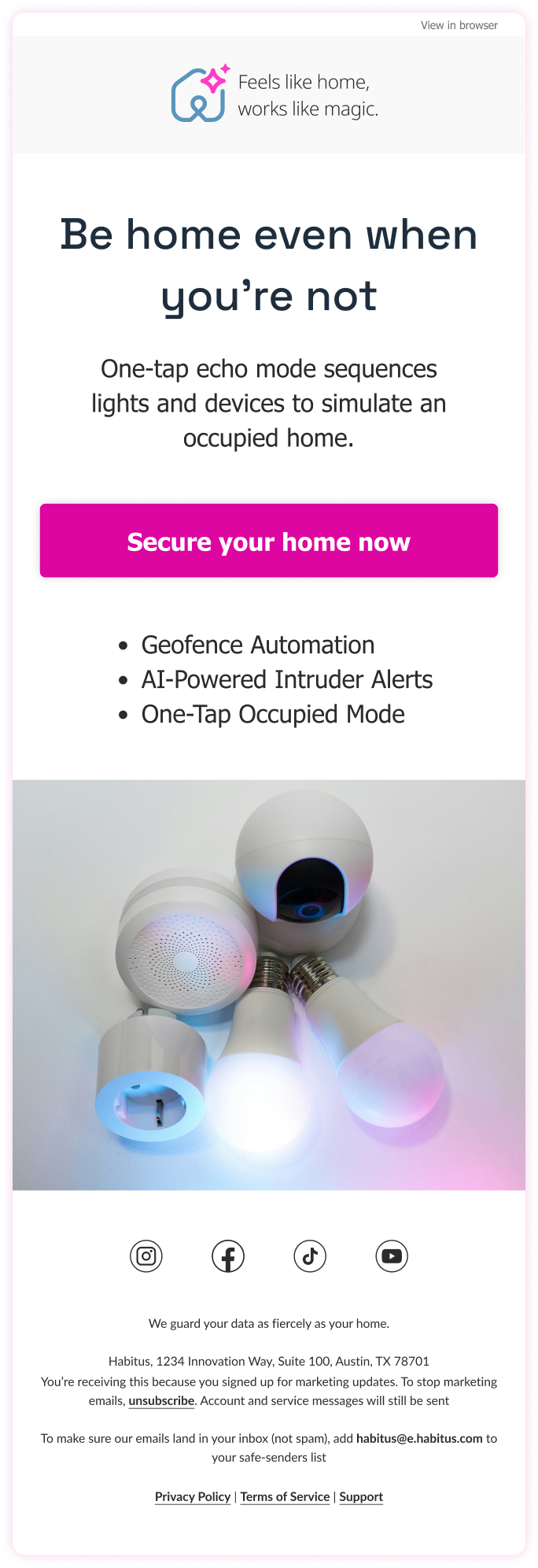
The prioritisation exercise surfaced three areas worth focusing on: CTA clarity and intent, mobile-first hierarchy, and restrained personalisation
Twelve journeys were rebuilt around those principles
Users don't read emails. They scan until something stops them
Every sizing decision here was made for the moment of recognition, not the full read
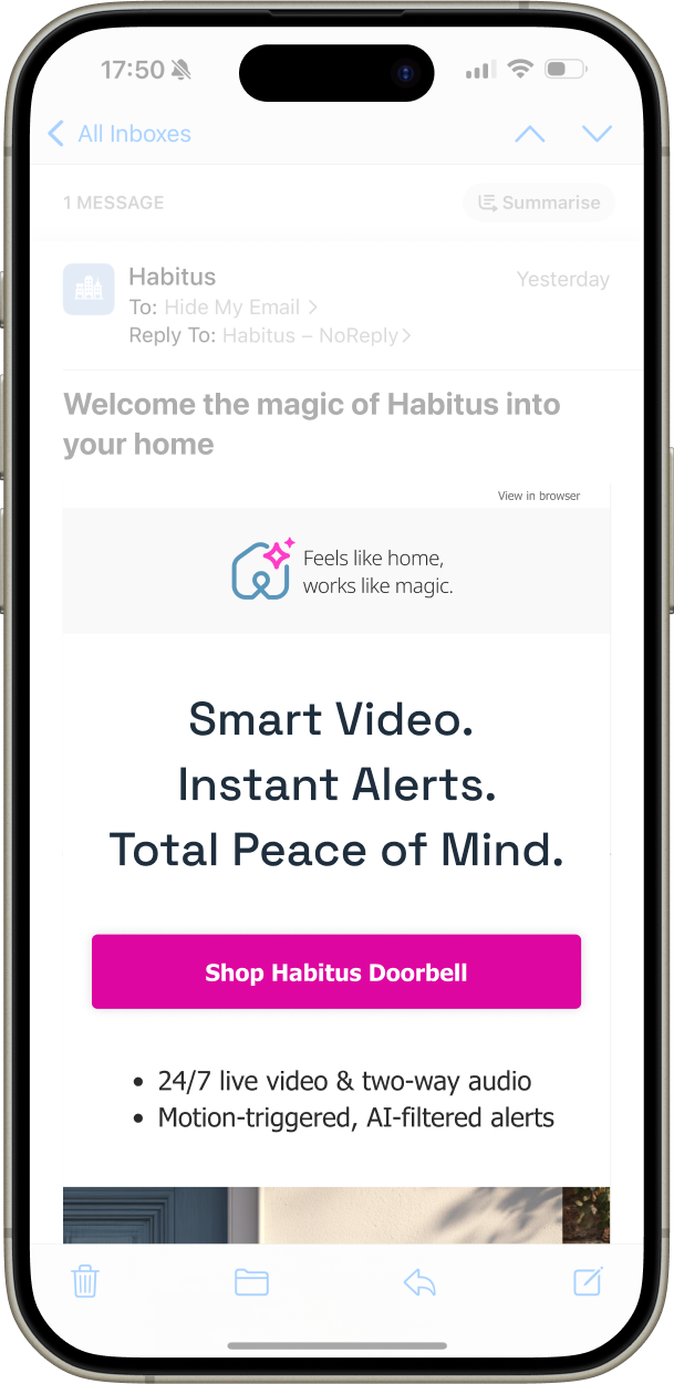
Message and CTA above the fold
Not as a best practice, but because that's where the decision happens
The data that existed was good, it just wasn't being used
Personalisation that had been sitting unused started doing actual work: real-time content, product images in abandoned carts, recommendations that reflected what someone had already shown interest in
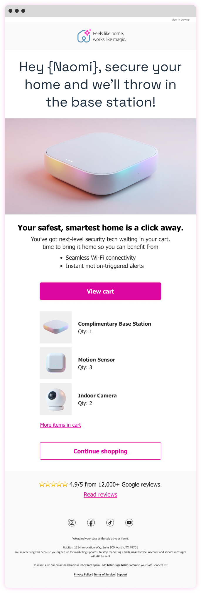
Customers on mobile who could see the CTA actually clicked it
Tighter headlines did the thinking so the customer didn't have to
Emails that remembered what the brand knew about its customers. The numbers noticed
The problem was never intent. The fix was making sure the execution was finally worthy of it
"Ian brought true design leadership — raising the quality of our work, guiding the team with clarity, and pushing us to think more strategically about the user experience"
Aligned Figma and SFMC patterns to reduce dev time and errors
Dynamic link generator and real-time basket tracking streamlined ops
A/B testing revealed what worked, from motion to message and offer
Readable-first email hierarchy, ensuring key messages remained clear within crowded inbox environments and constrained email layouts
Less content, clearer storytelling, reducing cognitive load so recipients could quickly understand the purpose of each email
Mobile-first structure, allowing messages to remain legible and scannable on small screens where most emails were opened
Message clarity over legal prominence, keeping the primary message visible above the fold rather than buried beneath compliance text
Standardised layouts over bespoke designs, making lifecycle journeys easier to maintain and reuse across campaigns
Reliable rendering over visual complexity, ensuring emails displayed consistently across inconsistent email clients
Heavy personalisation that felt artificial, avoiding messaging that could appear overly automated or insincere
Custom mobile font embedding, which added technical complexity without meaningfully improving readability
Decorative features that added little value, keeping the focus on message clarity rather than visual novelty
Personalisation works when it's useful, not when it's clever
Animated GIFs looked tacky on paper. The data disagreed. Used sparingly, they outperformed static alternatives
Becoming the customer was the research. Everything else validated it
Outlook continues to work in mysterious ways, but there’s (usually) a fix