Brief
Ran co-creation workshops to surface pain points
A co-creation-led redesign that increased signups by 23% and kept users engaged through a clearer, more focused onboarding journey
Product and ux lead (co-creation workshops, flows, UI, handover)
Pushed both platform and stakeholders to achieve results greater than the sum of their parts
Registration was a mess: inconsistent screens, broken flows, no clear path. Signups stalled and engagement slipped away
The challenge: turn a painful start into a simple, human journey
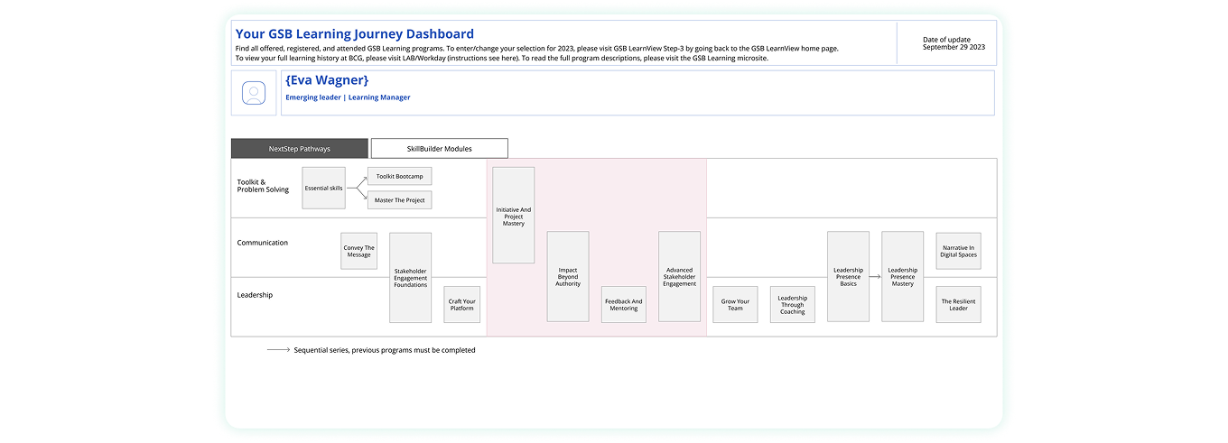
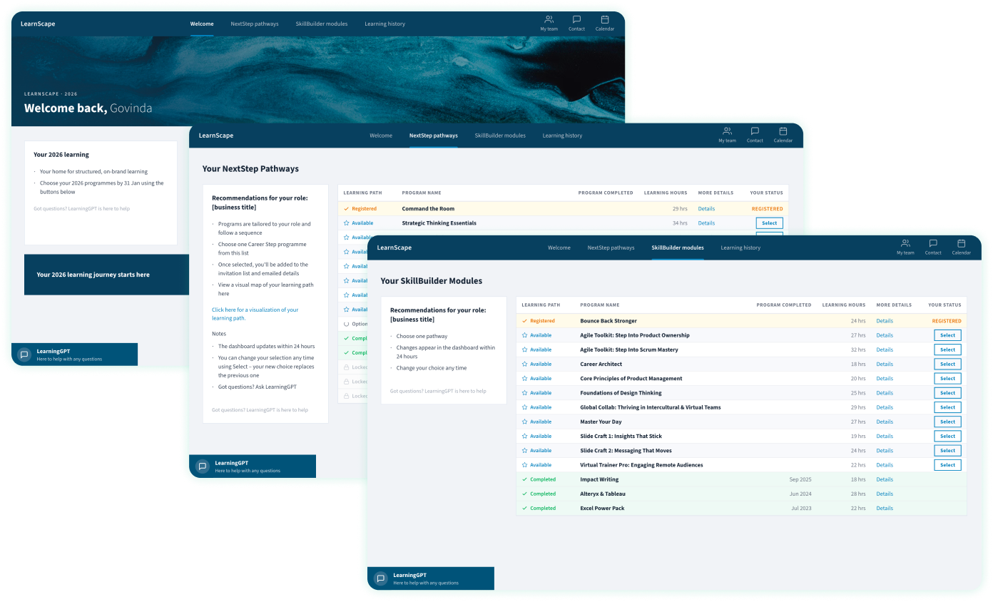
Unify fragmented learning journeys across a B2C Tableau training platform, leading UX review, redesign and delivery of practical, Tableau-ready recommendations
Ran co-creation workshops to surface pain points
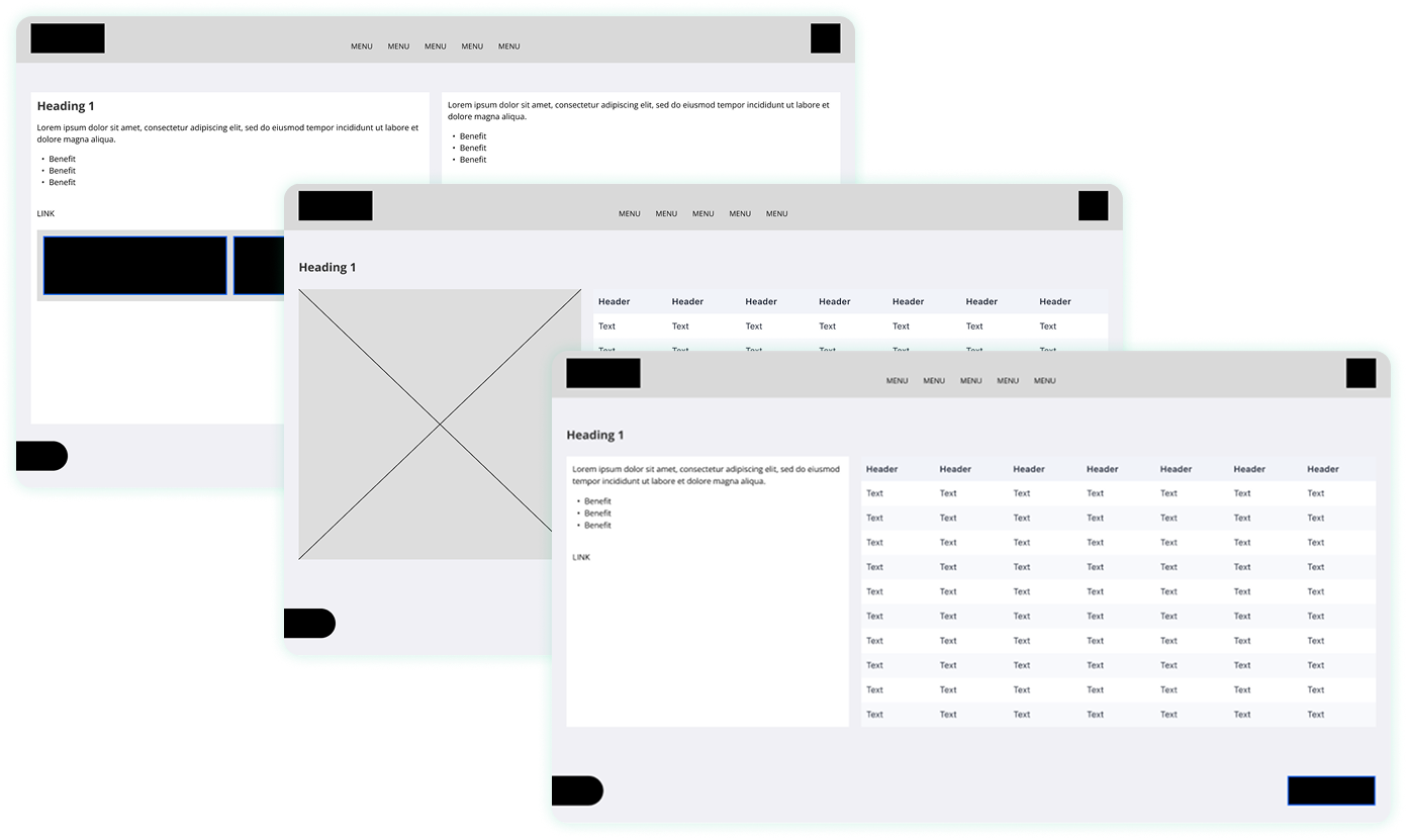
Prototyped flows in Miro + Figma, stress-tested with learners
Workshopped constraints with engineers upfront
Balanced creativity with feasibility → pushed Tableau to its limits
Shaped a clear, end to end registration journey from previously disconnected flows
Improved consistency across screens, reducing friction at key moments
Aligned user needs and platform constraints into one coherent direction
Turned confusion into cohesion: fewer clicks, more signups
Co-creation workshops unlocked buy-in and better ideas
Faster onboarding = happier learners and more confident stakeholders
Simplified journeys → easier paths boosted learner conversion
Co-creation workshops → unlocked better alignment and ideas
Streamlined flows → quicker onboarding for learners and admins
Feature-rich Figma flow with dev-ready assets for smooth handoff
Automated email flows: signup → onboarding → event participation
Scalable components balancing creativity with technical feasibility
Streamlined triggers and templates saved time and boosted consistency
Structured onboarding over system complexity, helping users move through the process step by step rather than confronting the full system at once
Clear hierarchy and journey signposting, ensuring users always understood where they were and what came next
Visible progress through each step, giving users confidence the journey was achievable and worth completing
Focused onboarding over full catalogue browsing, prioritising completion of the primary task rather than early exploration
Scannable course lists over detailed screens, allowing users to quickly compare options without becoming overwhelmed
External course pages over onboarding clutter, linking to deeper information only when users were ready to explore it
Background information during onboarding, avoiding content that did not help users complete the immediate task
Deep personalisation that slowed the system, keeping the experience fast and predictable across different learner roles
Catalogue exploration before completion, delaying broader browsing until the onboarding journey had been completed
Limits became launchpads for creativity
Playful persistence unlocked surprising solutions
Partnership with devs + stakeholders stretched the tools further than expected
Next time, focus experiments only where they earn their keep