Map
Audits + workshops to map and align 12 journeys
A lifecycle-led approach that unified 12 disconnected email journeys into one clear system, improving accessibility, speeding delivery, and increasing engagement by 41%
Lifecycle email and ux lead (journey mapping, content, templates, build)
Merged strategy, storytelling and technical craft to deliver measurable impact in a fast feedback loop
Marketing teams were firefighting, devs patching brittle templates, and users giving up mid-flow. Twelve disconnected journeys collapsed into chaos
The challenge: rebuild confidence with one unified system that shipped faster and actually got clicked
Five-month secondment with a US B2C brand to unify lifecycle journeys under one scalable system, leading strategy, design, templates and build through to deployment
Move a research wireframe into a clear, compliant, build-ready prototype that users could trust and developers could confidently build
Audits + workshops to map and align 12 journeys
Prototyped fast, tested early, validated ideas with real users
Worked with engineering to automate workflows and turn constraints into solutions
Each sprint layered automation + A/B testing for continuous improvement
Unified 12 fragmented journeys into one coherent lifecycle system
Restored trust across marketing, product and engineering through shared patterns
Created a foundation for continuous optimisation rather than one-off campaigns
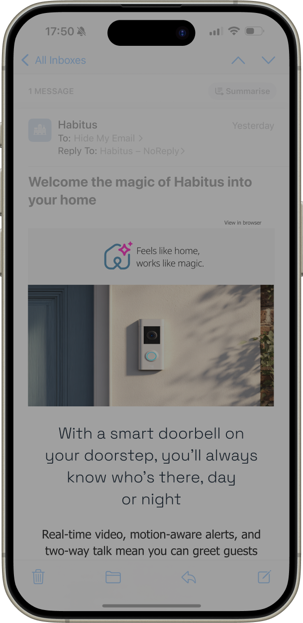
You’ve got 400 pixels before a swipe, so let’s make them count


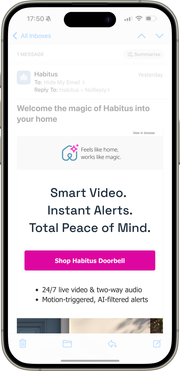
Clear, readable type because users don’t scroll for benefits, they stop when they see them
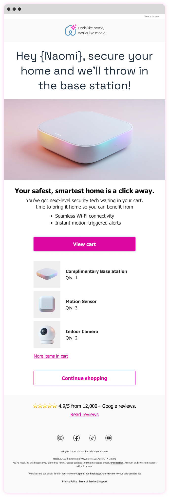
Personalisation isn’t creepy when it’s helpful

"Ian brought true design leadership — raising the quality of our work, guiding the team with clarity, and pushing us to think more strategically about the user experience"
Clearer calls-to-action above the fold → boosted engagement on mobile
Concise, snappier headlines → more clicks across campaigns
Smarter personalisation → significantly higher click-to-open rates
Streamlined 45 monthly emails across 12 journeys with a unified approach
Aligned Figma and SFMC patterns to reduce dev time and errors
Dynamic link generator and real-time basket tracking streamlined ops
A/B testing revealed what worked, from motion to message and offer
A small number of well-chosen levers delivered more impact than a broader redesign would have done
Readable-first email hierarchy, ensuring key messages remained clear within crowded inbox environments and constrained email layouts
Less content, clearer storytelling, reducing cognitive load so recipients could quickly understand the purpose of each email
Mobile-first structure, allowing messages to remain legible and scannable on small screens where most emails were opened
Message clarity over legal prominence, keeping the primary message visible above the fold rather than buried beneath compliance text
Standardised layouts over bespoke designs, making lifecycle journeys easier to maintain and reuse across campaigns
Reliable rendering over visual complexity, ensuring emails displayed consistently across inconsistent email clients
Heavy personalisation that felt artificial, avoiding messaging that could appear overly automated or insincere
Custom mobile font embedding, which added technical complexity without meaningfully improving readability
Decorative features that added little value, keeping the focus on message clarity rather than visual novelty
Outlook continues to work in mysterious ways, but there’s (usually) a fix
Personalisation and real-time content don’t just inform, they charm
Animated GIFs still earn their place, sparingly used, they delight
A healthy backlog isn’t admin, it’s momentum